HMI solution for hydrogen-powered commercial vans
Bamboo Apps designed an instrument cluster and an IVI system for a unique series of commercial vans powered by green energy
Services
UX/UI design
HMI architecture design
Technology
Designing an HMI for a line of futuristic vehicles
Reload Motors is a Berlin-based vehicle manufacturer that produces zero-emission commercial vans powered by hydrogen.
Bamboo Apps approached Reload Motors with a proposal. Our team offered to design and develop a combined instrument and infotainment cluster for a show car, but on a level that would allow for short-term series implementation.
The team would closely follow the client’s corporate style, industry regulations, and the latest HMI market trends in GUI design and development to create a user-centric HMI that relies on a strong design language and upholds the clean, high-tech brand image of Reload.
A powerful cluster & a top grade IVI
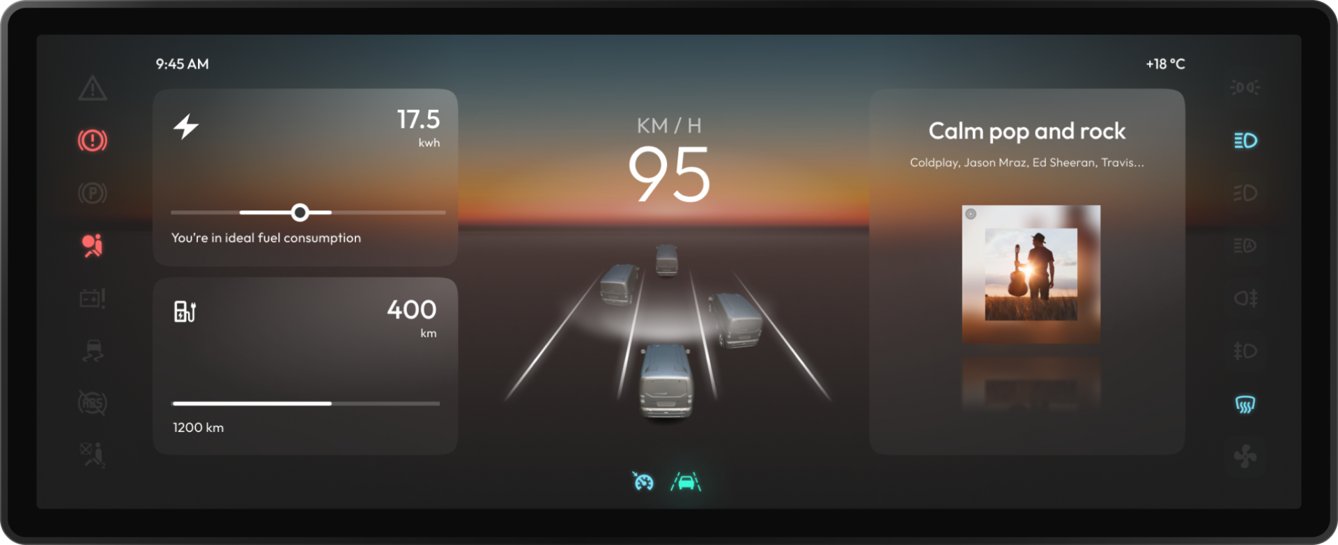
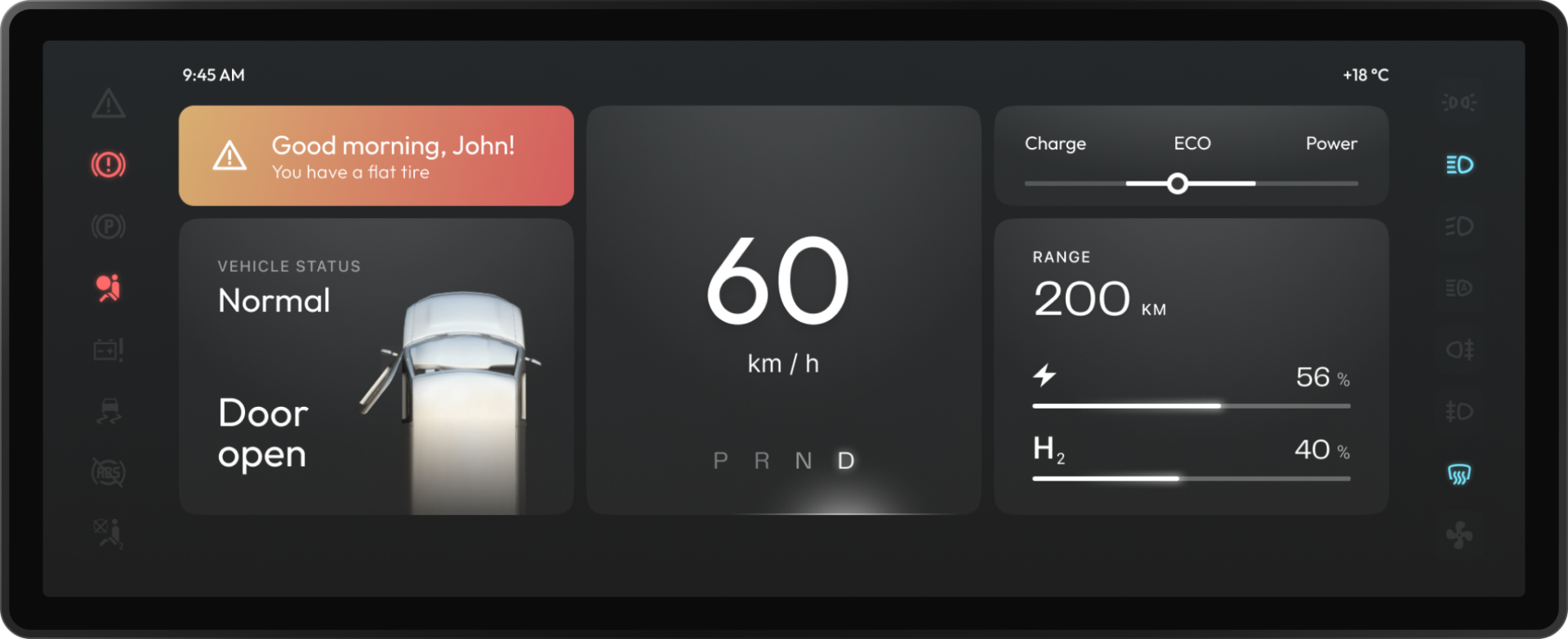
Bamboo Apps have designed a customisable digital instrument cluster and an in-vehicle infotainment system that organise data in easy-to-navigate screens.
Instrument cluster

Information architecture
The architecture was developed based on extensive internal and competitive research. The process included design thinking workshops with industry experts, competitor analysis, and the making of several prototypes.
The informational blocks, widgets, and icons for the instrument cluster were chosen based on mandatory industry standards, commonly accepted patterns, and our own expertise, as well as the help of Peter Roessger. It was important that the UI felt familiar to drivers entering the vehicle for the first time.
Sketches and wireframes
The Bamboo Apps team closely collaborated with the client to tackle the most pressing demands that drivers had regarding their digital instrument clusters. A special workshop was held to discuss driver needs: the idea to implement widgets for the instrument cluster came as a result of that.
We brainstormed a couple of options, considering different interaction scenarios together with the client. In the end, our teams went with option 3: it put emphasis on widgets, which allowed for the highest degree of customisation and flexibility. It would also allow the client to customise the cluster for different types of commercial transport.
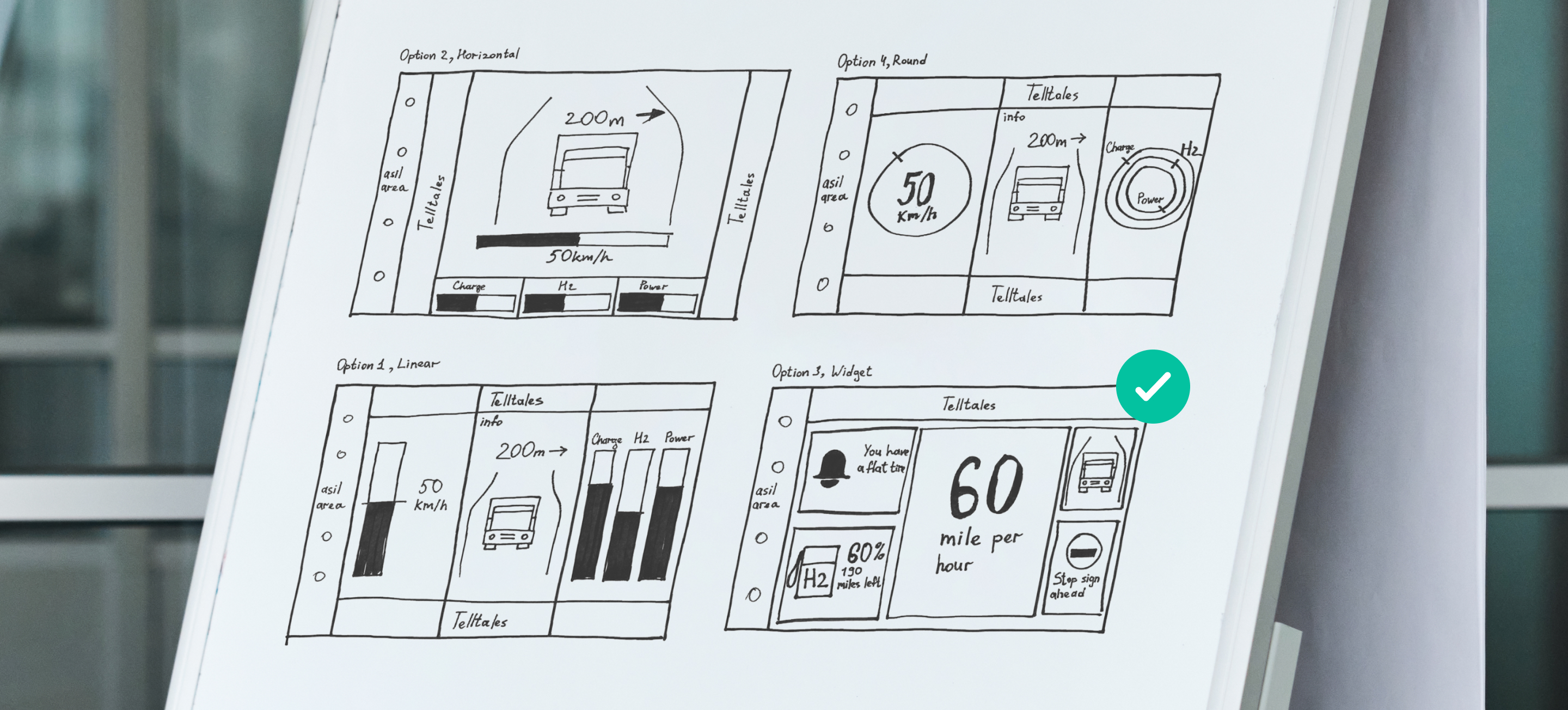
Layout
The layout was constructed in strict accordance with ISO standards, meaning that certain widgets and information could not be moved or hidden (e.g. check engine, the status bar). That said, users could create their own visual themes or switch between preset ones, customising non-mandatory widgets however they wanted.
Bamboo Apps put special emphasis on making the layout logical and understandable at a glance. We ensured that the UI is easily readable and recognisable with the core elements using large standardised icons.
User interface and features
The instrument cluster is rich with both basic and advanced features, including speedometer, turn signals, charge levels and power consumption, current trip distance, ADAS system information, speed limit, and more.
In some regions (for example, Berlin) the in-vehicle system can connect to the city infrastructure to give drivers advice on how fast they should go to make it to the next green light before it turns red.
Moreover, users can add widgets to the instrument cluster depending on the task at hand, the business they are working for, or personal driving style.
- Get a full scope of information on your journey.
- Never miss a green light.
- Personalise your driving experience with widgets.
In-vehicle infotainment

Information architecture
Our design strategy for the infotainment screen stemmed from the same type of research we did for the cluster: getting input from experts, analysing competitors, and, of course, brainstorming sessions.
Likewise, we came up with multiple interaction concepts and scenarios before devising common patterns and logic to dictate the design. The main goal was to create an infotainment system that was consistently easy to navigate.
Sketches and wireframes
The thing about automotive software design is that it needs to abide by very strict industry standards. So, our UX/UI designers worked together with Peter Roessger to deliver a design that had all the necessary components and indicators placed exactly where they needed to be, while still following a distinct corporate style.
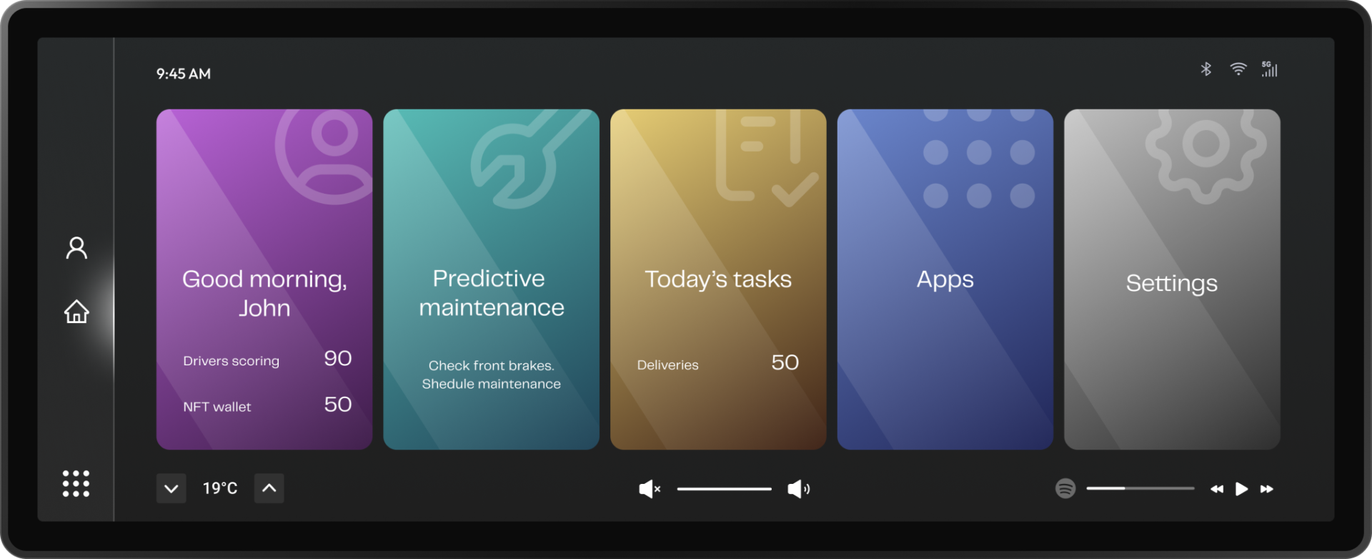
The home screen was supposed to show only the most relevant and important information (vehicle status, tasks, driver score, etc.). Our team brainstormed several options, and ended up going with number 4, as it displayed the most crucial information with maximum visibility.
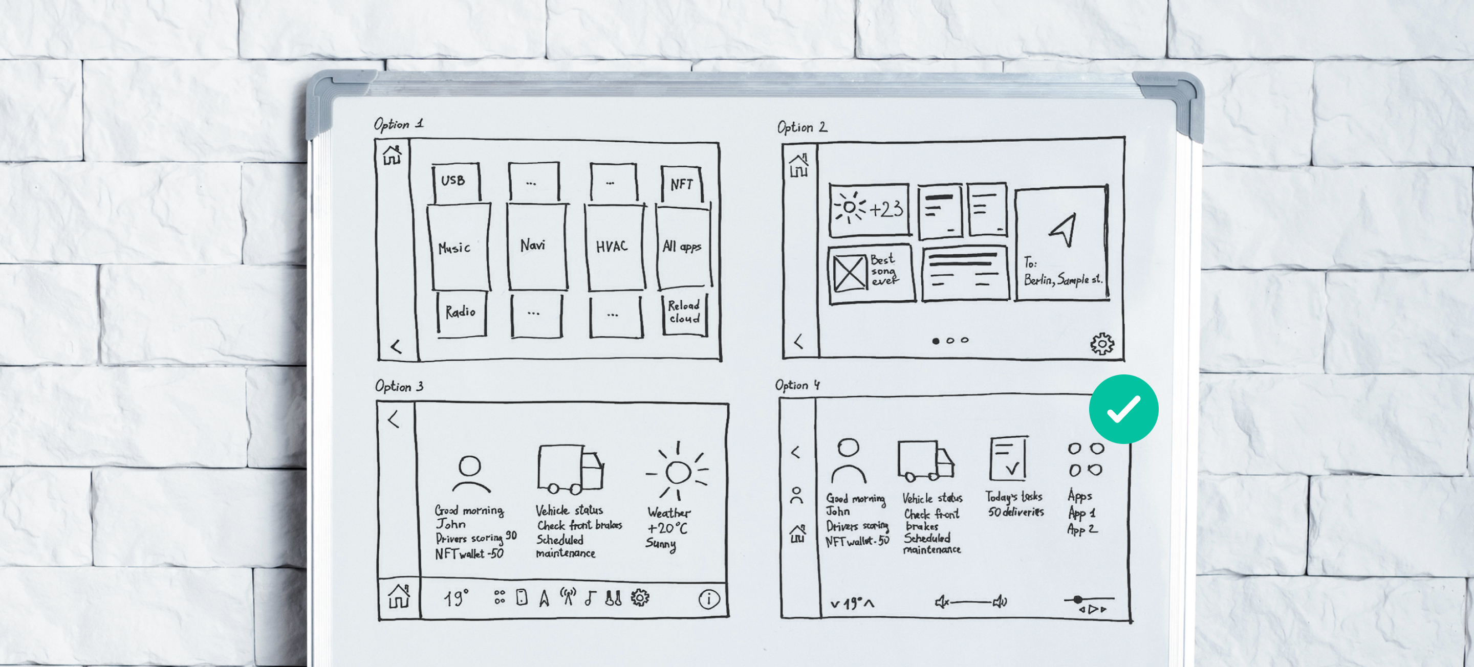
Layout
All apps and screens aside from the home screen were designed to share the same patterns of interaction, as per Peter Roessger’s recommendation. So the applications were split into main and secondary controls.
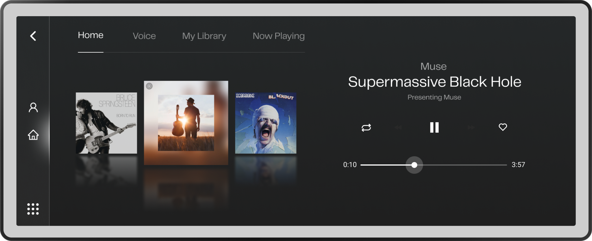
The permanent elements of the infotainment screen included the status and navigation bars, as well as the HVAC, volume, and music playback widgets.
User interface and features
The infotainment screen lets users:
- easily manage driver information;
- check vehicle health;
- monitor driver behaviour on the road;
- perform safety tasks and health exercises;
- purchase various services and features;
- access an NFT marketplace;
- follow the latest feature activations and updates.
Driver profile
The profile features basic information about the driver, their documents, insurance, level, safety score, balance, achievements, and purchased services. Switching vehicles is never a problem, since personal driver data, individual preferences (A/C, seat position, lighting), and feature subscriptions are safely stored in the cloud.
Driver profiles differ depending on whether the driver works for a particular company or as a private contractor.
The latter lets drivers search for job offers on a special marketplace or create a job offer of their own.
- quickly switch between driver accounts;
- authenticate with the OEM data platform;
- access UBI, payments, driver score analysis.
Gamified driver behaviour analysis
The software uses telematics and smart in-vehicle systems to measure:
- reaction time;
- tendency to accelerate hard relative to other drivers;
- speeding;
- sharp turning;
- driver’s mood;
- frequency of collision risks;
- fuel efficiency;
- etc.
Using the safety screen, drivers can see a breakdown of each metric to understand which aspects they should focus on while driving, as well as compare their performance with the results from last week.
The driver is also awarded a number of safety points based on these aspects. The more safety points a driver gets, the faster they level up, and the more in-app currency they gain. Drivers can also earn points by:
- completing safety tasks;
- checking driver health (breathing, level of focus, stress, aggression);
- performing health exercises.
Feature store
The currency can be spent on extra features that help make the driving experience more personalised and comfortable. Some suggested features can be purchased straight from the driver profile.
That said, payments in real-world currency are available as well. The store also supports discounts and limited-time offers for new features and upgrades.
Drivers can check the status of their subscriptions and purchased upgrades in the Last Activations tab.
- Purchase or upgrade features with in-app or real-world currency.
- Subscribe to infotainment services.
- Get better deals with limited-time offers and bundles.
NFT integration
Reload employs blockchain technology to ensure secure access to their vehicles and driver data. All Reload driver IDs are issued as non-fungible tokens, which accumulate driver levels and all the upgrades bought at the feature store.
The driver card can then be sold at the NFT marketplace, which helps the user earn some money, but resets their level to zero, clears their achievements, and wipes the purchased upgrades and functionality minted onto the token.
- Sell your driver card on an NFT marketplace.
- Increase the value of your NFT by levelling up and purchasing features.
- Purchase an NFT to receive big benefits right away.
Accident management
The software employs automatic accident detection technology. It allows for fast and accurate crash reporting with smart accident type-based forms integrated with insurance companies’ CRMs. The app lets drivers request roadside assistance, book an appointment at the nearest service centre, or order a replacement car.
- Log crashes with automatic accident detection.
- Quickly generate and fill out crash report forms.
- Request help and book service appointments.
Predictive maintenance
Thanks to the integration with in-vehicle telematics, drivers can check the state of different parts of the van, as well as see the mileage of wear and tear components such as starter battery, brake pads, and tires. The ability to notice warning signs before the issue becomes dangerous is an incredible way to ensure safety and cut future maintenance costs.
- Check vehicle condition from anywhere with remote diagnostics.
- Cut costs with predictive maintenance.
- Schedule maintenances manually or use automated maintenance plans.
A robust driver-oriented system
The team has designed a customisable instrument cluster alongside a feature-rich IVI that complied with all industry regulations and modern design principles. Despite the abundance of functionality (including features never before seen in the automotive UI industry, e.g. an internal NFT marketplace), the interface turned out highly versatile.
