We met up with the Head of Bamboo Apps Design Department, Maxim Krivolutsky the other week. Maxim has spearheaded design on projects for Rinspeed, Jaguar Land Rover, Škoda, Gentherm, Osram, and other high-profile clients. He has also worked on interface design for a large number of our internal R&D endeavours.
In our interview, Maxim talked about the current state of HMI design in Automotive, the challenges the industry faces in its transition to more digital controls, and the increasing integration of AI technologies.
Here is an edited transcript of the conversation we had with Maxim.
Let’s start from the beginning. Could you please tell us what you consider the biggest challenges in automotive interface design today?

“I think one of the main challenges is the shift from analog to digital controls. There are more and more methods of interaction that don’t involve physical buttons. Automotive companies are letting go of the latter in favour of digital or on-screen buttons. So from the design standpoint, the main task is to make them safe and understandable, first and foremost.”
From what I’m seeing, this in itself raises a lot of questions. Take, for example, multimodal interaction. Do you think it’s possible to integrate touchscreen, voice, and gesture controls in a cohesive and intuitive way for the user? If yes, how?
It’s possible, but it is a challenge. The question answers itself. There are certain driver behavioural patterns, which similar automotive control systems have been using for many years. Making the transition to some new type of interaction smoother is one of the designer’s main tasks.
And can you provide any examples of practices that could aid in making that smooth transition?
You should probably do it gradually. Gradual iteration, perhaps. Not throwing everything out in one day, but iterating step by step.
So we’d implement a touchscreen in one model, then voice in the next one, then gestures in the next one, and so on?
Perhaps something like that. That’s already how it is, really. Though, some companies switch to everything new at once. For example, Toyota and Honda shifted everything to screens pretty abruptly in some of their models.
But isn’t there a risk of a cognitive overload when so many new control methods are introduced? Some parts are controlled one way, others are in another.
That’s always a risk. The designer’s job is to minimise that risk. The driver must be focused on driving and not on how to turn on the conditioner, climate, or the radio.
Can you provide any concrete examples of approaches that could help minimise the risk of driver distraction?
I’d say you just gotta take it and test it.
So just testing?
Yes. Suggest ideas, test them on the target audience, and watch their reactions. You can use the experience of both young and long-time drivers.
Can you tell a bit more about the process of testing automotive interfaces? How is it organised, how do you filter user feedback?
Everyone is different, and everyone gives different feedback. First of all you need to filter the feedback that goes against security standards, ISO standards, and common sense in general. The feedback aimed at improving a particular feature, that’s the one you gotta listen to.
What’s an example of feedback that goes against ISO and common sense? Adding a feature that would loudly flash something on the screen?

“Yeah, add a flickering animation or element “so that I see this indicator for sure”. Or the opposite, make something smaller “so that I’m not distracted by these indicators”.
So what should you consider when presenting information to the driver? How do you ensure that it’s both visible and doesn’t distract them from the road? I don’t just mean indicators, but pop-up notifications, too.
Don’t overload the user with information, don’t take their attention away from driving. Icons and symbols are often faster to read than text, wherever they are applicable.
So it’s always better to choose a graphical indicator over text notifications?
Yes. Though that’s usually the case as is – take engine errors for example. Some cars show what exactly went wrong on the panel next to the indicator, but sometimes they’ll just show an error.
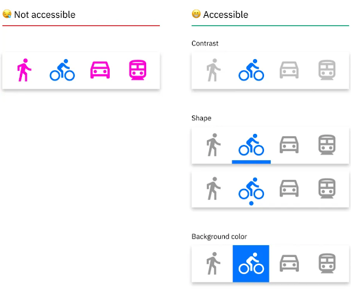
And what about accessibility? How do we ensure that interfaces with all of their indicators and control methods accommodate a broad range of users?
I think it’s good to know what disabilities we’re accommodating for here. I’m not sure whether you can drive with, say, colour blindness, but then again, we don’t use a billion colours. At least it’s best not to, so that objects can be distinguished and interacted with quicker.
Of course, it’s not about disabilities that prevent people from driving altogether.
Well, we can fantasise a bit about that, because… Well, this is somewhat off-topic. But some time ago cars with manual control looked a little different from what they look like now. Old cars had little cranks attached to the pedals, little levers. Now it’s all a bit different.
So the number of control levers in cars has gradually decreased?
Yeah, they’re rethinking that now. New stages of development are coming.
You say cars looked like that “some time ago”, how long ago do you mean? 50 years ago or 10 years ago?
The things I’ve seen were 10-15 years ago. But maybe I’m out of touch.
Let’s talk a bit about road conditions. They can vary a lot. How do you design interfaces in a way that ensures they’re equally effective on the highway, in the city, and during parking? And how does road context play into interface design in general?
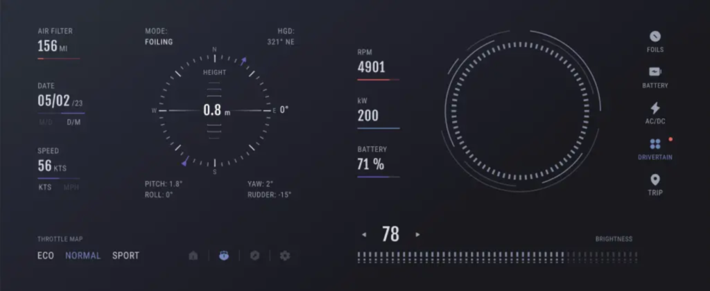
It can be a factor if it’s some utility car. If we’re engineering a van or a boat – that’s also HMI – we consider the environment in which it will be used. Of course the interface of a boat will differ from the interface of a smart car, because they have different environments, different lighting, and different volume of information.
And if we’re talking about different types of cars? For instance, sports cars and offroads?
Ideally yes, there will be a difference. There is a certain volume of information I need to know when driving an offroad – the work of the four-wheel drive, for example, the angles, where and how the axes are working, etc. I need to be able to control the front axis and the back axis, the suspension height.
In a sports car, I’ll have different priorities: engine temperature, level of turbine boost, and so on. And I won’t, for example, need sophisticated navigation systems, because I’m driving on a track.
Makes sense. Then let’s move onto common trends. Maybe there have been some recent innovations from major automakers that seem interesting or important to you?
Well, more manufacturers are dabbling in L3 automation. BMW plans to release an L3 car in 2024, for one. Before autonomous features of this level were only allowed on specific highways, but it looks like we’ll be seeing those allowed on more types of roads. At least I know this is what BMW is aiming for. Their competitors will most likely try to do a similar thing.
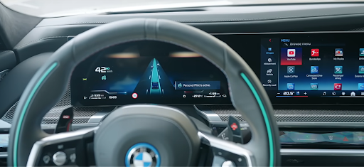
So more cars will get to that level of automation, and HMIs will change accordingly. They’ll need more precise maps, for example. Traffic lights, lane markings, obstacles, pedestrian crossings – all those will have to be taken into account.

“Though, I guess sensors will be doing a lot of the heavy lifting there. LiDARs are already pretty common, so we’ll probably see more of them. Oh, there are also cameras with neural network integration. AR displays, too. They can highlight lane changes, traffic signals, and other things like that to drivers. Tech like this should become a bit more common and affordable.”
Also distancing from the typical analog controls in favour of digital ones. The climate control block is now an on-screen menu more often than not. And huge radio blocks with disks are disappearing – they too are becoming menus on the screen.
How do you think this last part influences the user experience?
It creates new interaction patterns. Before I could drive a car and turn the radio on without looking at it, just physically finding the volume knob with my hand and turning it. Now I’ll have to relearn all that and probably distract myself from the road to look at the screen.
So the risk of driver distraction is inevitably higher?
I think so.
Got any ideas on how to improve it? Maybe with haptics or something similar?
Yeah, haptic feedback can help. Voice controls, too – they don’t exactly force you to look away from the road. Same thing with gestures. The last two may not have a great reputation among drivers because of older and less accurate systems. But modern AI has already improved them a ton, they’re reliable. At this point it’s just a question of availability.
Then let’s talk some more about this ongoing trend for AI and ML. How is it being applied in HMI design and how can it be applied in your opinion?
The first and the most obvious is probably sign and object recognition systems. With the help of ML we can identify the kind of sign, speed limit, or obstacle the car is facing – doggies, kitties, pedestrians, other vehicles.
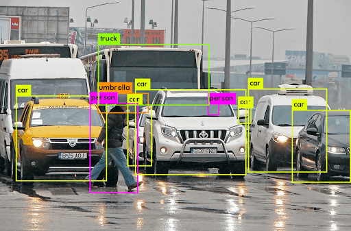
If we’re identifying a vehicle, we can see if it’s a passenger car, an offroad, a van, or a motorcycle. Sometimes it can even save your life, if there’s an emergency stop or some weird manoeuvre.
The second thing is voice assistance. It’s not exactly AI, but more ML. Voice assistants can help you by giving hints and allowing you to interact with a car in a smoother way, like our IVO project. I can ask for tips, go through onboarding, ask where different things are, what just happened, why a particular indicator lit up, and so on.
What stage, would you say, AI integration in automotive is at right now?
I’d say, it’s in its infancy. It’s just beginning to gain traction, and more will come later.
It can partially help solve the problem of interacting with complex vehicle interfaces. We can say “create a route to the nearest McDonald’s” and won’t have to interact with the map or anything else. Or let’s say I’m driving to a destination, the route is already set, and I say “let’s stop by a gas station on the way”.

“A little off topic, but I get this issue constantly when I need to go on a long trip. We were driving through Poland on an autobahn the other day and needed to fuel. But the navigator gave us gas stations that weren’t convenient for driving on an autobahn: go there, turn around, drive into this city, and then drive back parallel to the autobahn for 15 kilometres to re-enter it, because it doesn’t have a lot of entrances. Like, come on, it would be easier to drive straight for 20 kilometres and stop by a gas station on the way.”
And AI will supposedly be better at that?
Supposedly, yes. At least it’s possible to teach in theory. For example, to calculate total time loss it would count the average time it takes to fuel, the average time spent at the gas station (say, 7-15 minutes), the kilometres travelled, the average speed on that stretch of the road, the average speed of other drivers, and how fast they usually complete that stretch.
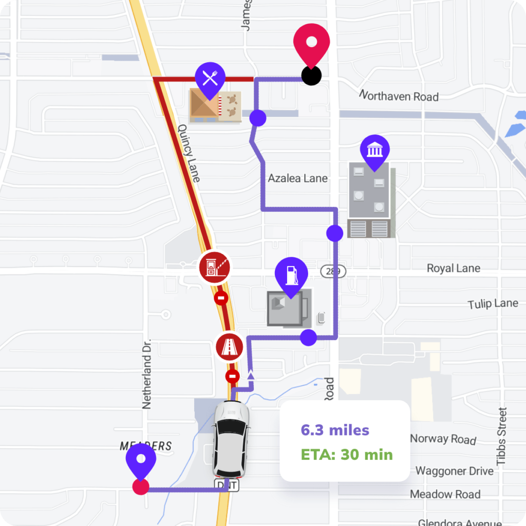
If the gas station is on the way, I leave the autobahn and my speed drops from 140 to 80, then to 40, then I stop at the gas station, fuel up, and continue my journey. And I don’t need to drive in circles through villages like I had to 5 days ago, when we were led across the Polish countryside. It was beautiful, of course, the villages were pretty, but that’s not what you want to indulge in when you have places to be.
At least you enjoyed the scenery.
Uh-huh. But the industrial outskirts of both Lodz and Wroclaw are a bit too much for one trip.
Alright then, let’s get back to our topic. We’ve got two questions left. Do you think interface design from different industries can inspire innovations in automotive HMI design?
Design trends from other fields are gradually making their way to automotive interfaces. It’s not a very fast process. If we look at the industry as a whole, automotive interface designs lag behind mobile, desktop, web, and others. But they’re catching up little by little. For example, skeuomorphism is still used in Automotive, even though it’s already considered oldschool in web and mobile.
And which of these design trends are making or might make its way to Automotive soon?
Minimalism.
Purely visual?
Yes, less noise, less clutter, fewer colours, fewer gradients.
And in terms of functionality?
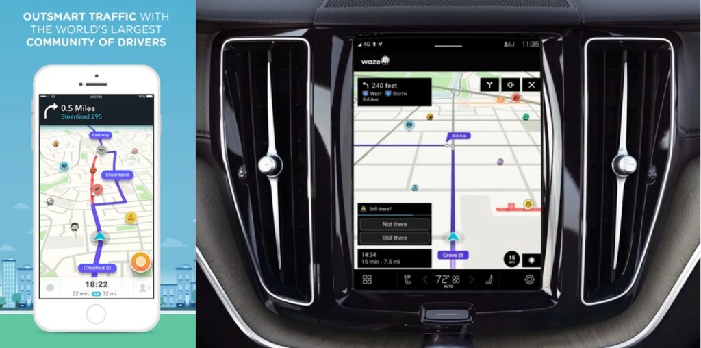
A lot of mobile apps are migrating to automotive systems as is. So they expand the functionality in that way. Most are aimed at entertainment: Spotify, Youtube, Audible, things like that.
There are also a lot of different map applications. Some perform pretty specific functions, like ChargePoint helping EV drivers locate charging stations. It also began as a mobile app. There are apps to help with onboarding, too, like IVO for AAOS and mobile. Well, I already mentioned that one. There are a lot of opportunities, really.
HMI designer’s job here is to make sure those mobile apps are properly adapted to automotive systems. Extra functionality is good, but it needs to actually be usable on the road.
And the final question for you: what’s the best way to stay up to date on the latest automotive design trends?
Going to expos. Keeping an eye not just on industry leaders, but startups, smaller companies, and design studios, too. They also seek new solutions, but they can demonstrate and integrate them faster compared to industry giants. There are a lot of good ideas that just aren’t on the surface. Everyone is simply used to looking at what BMW, Audi, and Mercedes are doing.
And how do you properly integrate these ideas into automotive design? How can you tell that a trend will last and isn’t just a passing fad or experiment?
You have to understand how this new idea will interact or contradict established patterns. At the end of the day, a car is meant to last you many years, unlike a smartphone that doesn’t affect your safety.
About Bamboo Apps
Bamboo Apps is an Estonian software development company focused on innovative solutions for the Automotive sector. The team’s expertise encompasses HMI design and development, car connectivity, shared mobility, and automotive ML technologies.
Bamboo Apps’ dedication to quality has not gone unnoticed by top OEMs and Tier-1 suppliers, with such partners as Mitsubishi Electric, Škoda Auto, Jaguar Land Rover, and Rinspeed vouching for their services.
